Elastic RUM dashboard

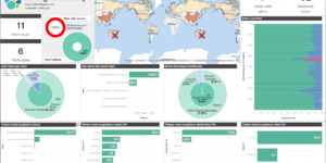
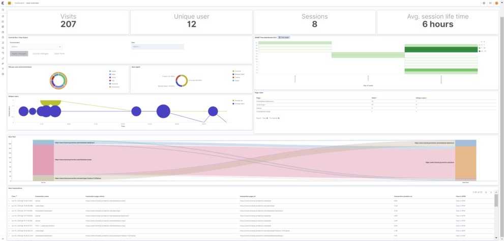
This dashboard improves the visibility into your RUM data collected by the real user monitoring agent of Elastic. It will enable high level user metrics as well as insights into the users journey. Its fully working without much manual effort. Use this real user monitoring Kibana dashboard to get better insight into what your users are doing in your web application.

Highlights:

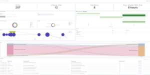
  1. Visualize a heat map using the hour of day vs. day of week. Enables to quickly see when your application is used mostly.
  2. Visualize the journey of your users including time spend per page.
  3. Visualize the flow of your users. How many users are navigating from one page to the other.

After purchase you will receive a zip file containing the needed files to quickly start using that data.

If you do not know how to use Real User Monitoring with Elastic in general check this.

Tested versions
ECS compliant

You must log in to submit a review.

Related downloads

CMDB dependency in Kibana Dashboard

Kibana vega example to show how to load visualize relationships between different infrastructure and network components in vega.

Azure billing data network

A vega visualization that shows the connection between resource group, resource type and the resource itself based on Elastic agent azure billing data integration.

Kibana Enhanced Table plugin

Data Table visualization with enhanced features like computed columns, pivot table or filter bar

Elastic Cloud Billing data collection and Kibana dashboard

Pulls Elastic Cloud Billing information from the Billing API then sends it to an Elasticsearch cluster and visualizes the results in Kibana dashboards.

Ask Me Anything Booth – Canvas Example

This is an example canvas page that shows how to visualize using canvas in general.

Resource Optimization Dashboard

Elastic Resource Optimization Dashboard to seamlessly integrate APM insights with cloud cost data for actionable resource management and cost-saving strategies

These downloads could be also interesting for you

Kibana Enhanced Table plugin

Data Table visualization with enhanced features like computed columns, pivot table or filter bar

Data flow canvas

Average rating:

This canvas examples shows some possibilities of how to visualize data flows. Every flow can be activated / deactivated based on your Elasticsearch data.

Vega Compound Gauge

This is a compund gauge visualization made with Vega. Its very helpful for visualization of percentage values.

Office 365 dashboards

A collection of Kibana dashboards to provide a holistic view of Microsoft Office 365 environments

CMDB dependency in Kibana Dashboard

Kibana vega example to show how to load visualize relationships between different infrastructure and network components in vega.

Lens Conversion Rate

Lens conversion rate for RUM data using Lens Formulas