APM Canvas example

Description

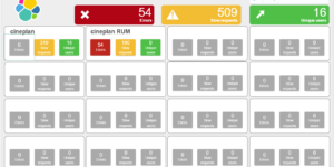
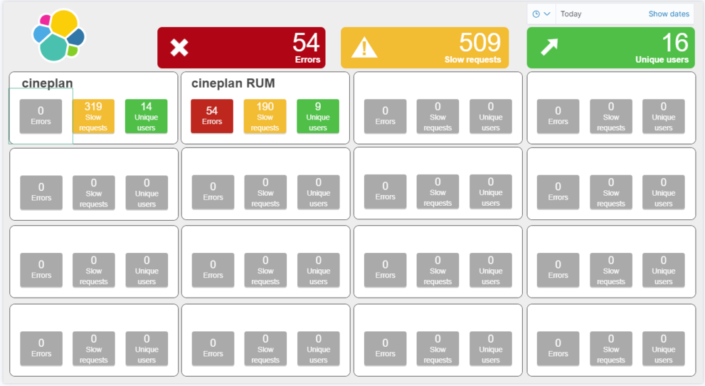
This canvas dashboards shows the status of services in Elastic APM as traffic lights.

This canvas is adaptive based on the number of services that you are observing with Elastic APM. You can have between 1 and 16 services. Every app based traffic light is also a drill down button. The buttons are linking to one of your dashboards. You configure the target dashboard with global variables. Take care that the dashboard can work with APM data.

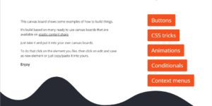
You can also use this canvas example to learn more about how to use canvas variables, conditionals and custom drilldowns.

This Kibana canvas example can be used to learn how to

  • build traffic lights in Canvas using conditionals
  • use multiple requests in one expression (element)
  • dynamically add content Kibana canvas elements
  • use global and expression based variables
  • configure dynamic links to Kibana objects

Configuration

This canvas has global variables set to configure a few things:

dashboard_id: The ID of the dashboard that you would like to link to.

kibana_space_id: The Kibana space ID of the dashboard that you would like to link.

label_red_box: This is the label text for every red box.

label_yellow_box: This is the label text for every yellow box.

label_green_box: This is the label text for every green box.

Tested versions 7.x, 7.1, 7.2, 7.3, 7.4, 7.5, 7.6, 7.7, 7.8, 7.9, 7.10
ECS compliant

Reviews

  • Work immediatly

    Just uploaded it into my Kibana and it immediatly works! That helps a lot!!

    276 of 549 people found this review helpful.

    Help other customers find the most helpful reviews

    Did you find this review helpful? Yes No

  • You must log in to submit a review.

    Related downloads

    Office display canvas example

    Kibana canvas example showing an office screen with weather, news and stock information

    Data flow canvas

    Average rating:

    This canvas examples shows some possibilities of how to visualize data flows. Every flow can be activated / deactivated based on your Elasticsearch data.

    Resource Optimization Dashboard

    Elastic Resource Optimization Dashboard to seamlessly integrate APM insights with cloud cost data for actionable resource management and cost-saving strategies

    Vega Compound Gauge

    This is a compund gauge visualization made with Vega. Its very helpful for visualization of percentage values.

    Timetable canvas

    This canvas examples shows timetable data from trains. Its build based on the real world information panel in german trian stations. Its refreshing based on current time.

    osquery performance dashboard

    Kibana Dashboard example to visualize osquery performance

    These downloads could be also interesting for you

    Sigma Elastic SIEM rules for web server logs

    A collection of rules based on the Sigma detection rules for web server looks, e.g. apache, nginx or IIS.

    Google Cloud Log Ingestion dashboard

    Canvas Board to analyze the log data collection of Google Cloud via Dataflow using the Google Cloud Metric module data

    Coffee Canvas Example

    Kibana Canvas example infographic to show coffee consumption on a wallboard

    Timetable canvas

    This canvas examples shows timetable data from trains. Its build based on the real world information panel in german trian stations. Its refreshing based on current time.

    Cloudflare Kibana dashboards

    Cloudflare dashboards and ingest pipelines to visualize cloudflare logs