Description
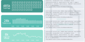
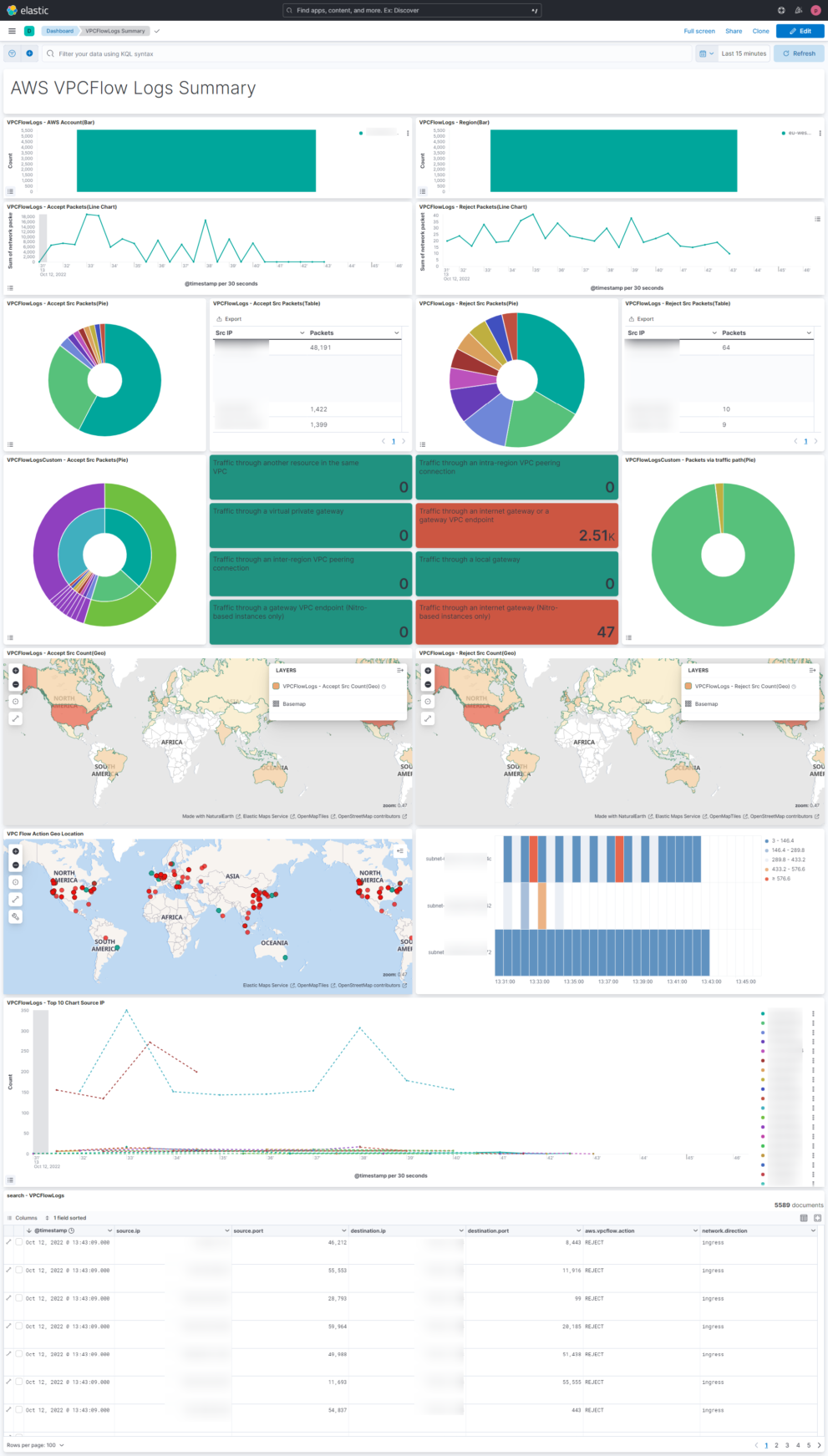
This Elastic / Kibana dashboard visualizes the AWS VPC Flow data that can be collected via the AWS VPC Flow Elastic Agent integration as well as via the elastic serverless forwarder (available in SAR).
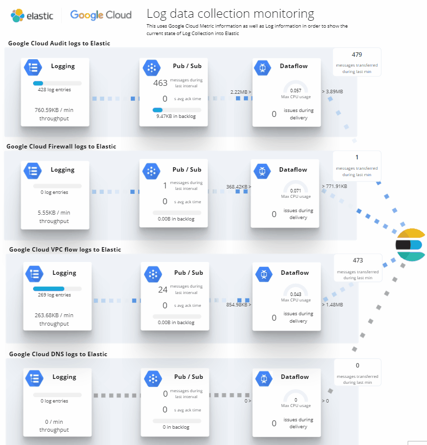
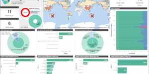
The target of the dashboard is to provide an complete overview about the VPC Flow logs. It helps to get an understand of how the data is flowing. The screenshot shows a small AWS network setup and how its reflected in the dashboard. In combination with other service specific dashboards it generates a good summary for everything in regards to Network Monitoring.
To get started with Elastic within AWS you can use the Marketplace integration. This includes a cloud formation template that is creating the Elastic as well as the AWS environment for the user.
What are AWS VPC Flow logs?
VPC Flow Logs is a feature that enables you to capture information about the IP traffic going to and from network interfaces in your VPC. Flow log data can be published to the following locations: Amazon CloudWatch Logs, Amazon S3, or Amazon Kinesis Data Firehose. After you create a flow log, you can retrieve and view the flow log records in the log group, bucket, or delivery stream that you configured.
Flow logs can help you with a number of tasks, such as:
- Diagnosing overly restrictive security group rules
- Monitoring the traffic that is reaching your instance
- Determining the direction of the traffic to and from the network interfaces
Flow log data is collected outside of the path of your network traffic, and therefore does not affect network throughput or latency. You can create or delete flow logs without any risk of impact to network performance.
More in the AWS docs
| Tested versions | 8.x |
| ECS compliant | Yes |
You must log in to submit a review.