Vega Compound gauge

Description

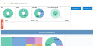
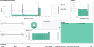
These are Compound Gauges made with Vega. The download includes two examples. The examples are made with ECS compliant metric data. You can either use the system integration package of the Elastic Agent or Metricbeat with the system module. Both will show you results. If you don’t have a metric index your deployment you will see an error message.

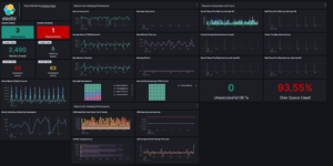
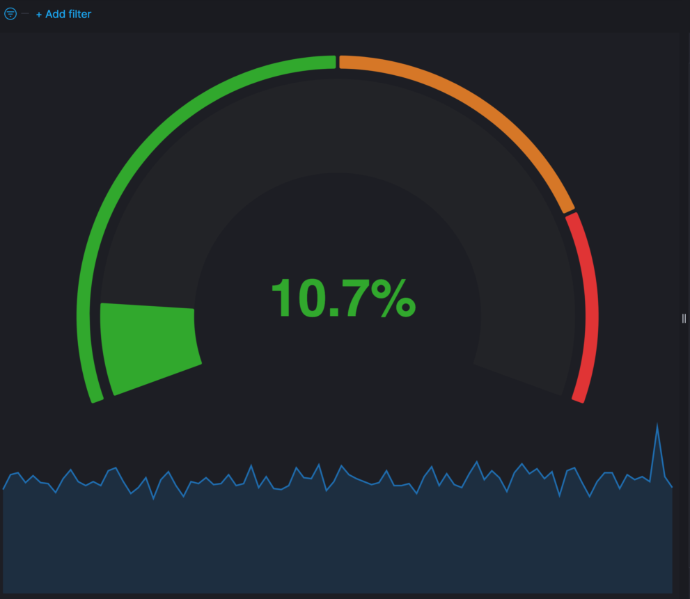
Compound Percent Gauge

This one is good for percent values like Percent CPU. Configure the colors and the steps base on your needs.

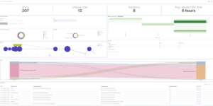
Compound Value Gauge

This one is good for values like Load Average. While any metric can be used its always good to know the range the values will be in.

Tested versions 7.x
ECS compliant

You must log in to submit a review.

Related downloads

RUM extension dashboard

This dashboard provide deeper insight into the real user monitoring data collected by Elastic RUM.

Elastic Cloud Billing data collection and Kibana dashboard

Pulls Elastic Cloud Billing information from the Billing API then sends it to an Elasticsearch cluster and visualizes the results in Kibana dashboards.

osquery performance dashboard

Kibana Dashboard example to visualize osquery performance

Vega Compound Gauge

This is a compund gauge visualization made with Vega. Its very helpful for visualization of percentage values.

Watch for changes in IOWaits

A watch which alerts if the time spent by a hosts CPU in IOWait, has increased by more than than N% in the last Y mins.

Kubernetes architecture overview

Vega visualization to show the dependencies between the different Kubernetes components in a single visualization

These downloads could be also interesting for you

Cloudflare Kibana dashboards

Cloudflare dashboards and ingest pipelines to visualize cloudflare logs

Sankey visualization example

This is an example of how to build an sankey visualization using the vega visualization in Kibana.

Crawler dashboard

A Kibana dashboard that visualizes the result of the crawler from Elastic Enterprise Search

Timetable canvas

This canvas examples shows timetable data from trains. Its build based on the real world information panel in german trian stations. Its refreshing based on current time.

Google Cloud monitoring dashboard

Dashboard to monitor GCP resources using different metrics and logs.

Data flow canvas

Average rating:

This canvas examples shows some possibilities of how to visualize data flows. Every flow can be activated / deactivated based on your Elasticsearch data.