
Visualizations Download overview
Here you can find prebuilt Kibana visualizations to enhance your Kibana dashboards. This could be a special vega visualization that you can adapt to your needs or it could be a nice visualization for a specific datasource. If you download one of our dashboards there are also a lot of visualizations included. Those Kibana visualizations are not part of this Kibana download gallery.
Visualizations downloads
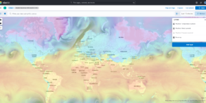
Kibana Maps with Open Weather Map
This is the default basemap of Kibana incl. the Open Weather Map tile for temperature, wind and pressure
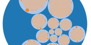
Kubernetes architecture overview
Vega visualization to show the dependencies between the different Kubernetes components in a single visualization
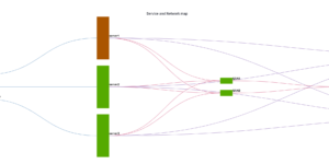
CMDB dependency in Kibana Dashboard
Kibana vega example to show how to load visualize relationships between different infrastructure and network components in vega.
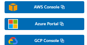
Buttons for Kibana dashboards
Link to every content you want within your Kibana dashboards. This example is using links to cloud providers.
Office 365 dashboards
A collection of Kibana dashboards to provide a holistic view of Microsoft Office 365 environments
Kibana Enhanced Table plugin
Data Table visualization with enhanced features like computed columns, pivot table or filter bar
More about Visualizations
Kibana comes with a lot of different visualization types. You can built Kibana visualizations completely from scratch or use visualizations that are pre configured by Kibana. To download Kibana visualizations you just need to choose the best fit for your use case.
Kibana offers simple chart visualizations like Pie charts, Gauge charts, Line or Bar charts. To create them as easy and quick as possible Elastic offers the Lens visualization type. Lens is a drag and drop chart creation tool that ease the creation of any chart.
Kibana also offers Maps visualizations that are great to visualize any kind of geographical information. The Maps visualizations are extremely feature rich and powerful. They are a great addition to any kind of Kibana dashboard.
Using the controls visualizations in one of your dashboards you can easily set up filters that are useful to dive deeper into the data analysis.
Lastly its also possible to integrate some rich prebuilt visuals like Log streams and anomaly explorer views into your Kibana dashboard. Thats great to use all the Solutions specific features also in your custom visualization or dashboard.