Description
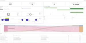
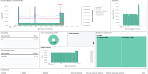
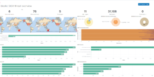
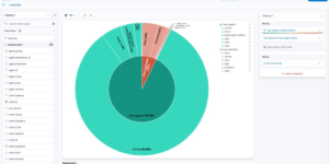
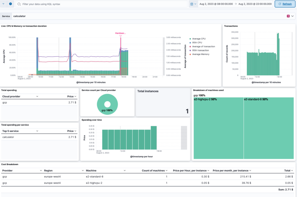
Maximize your cloud efficiency with the Elastic Resource Optimization Dashboard. This powerful tool combines Application Performance Monitoring (APM) metadata with cloud resource metrics to give you a comprehensive view of your cloud infrastructure’s performance and cost. With insights gathered from APM, you can analyze transaction times, track error rates, and observe application usage patterns. When integrated with financial data, this dashboard breaks down your cloud costs by application, service, or feature, allowing for precise budget management and optimization.
This intelligent dashboard leverages Elastic’s Machine Learning to detect anomalies in your cloud spend, providing alerts for unusual activity that could signal optimization opportunities. Kibana Lens visualization makes it easy to interpret complex cost and performance data, aiding in the collaborative decision-making process across Cloud Ops, FinOps, and DevOps teams.
By using the Elastic Resource Optimization Dashboard, you can streamline your cloud operations, ensure that resources are being used efficiently, and align operational metrics with business outcomes. This dashboard is an invaluable solution for those aiming to manage their cloud investments responsibly while achieving peak performance and cost savings.
Download this dashboard today and transform the way you manage cloud resources and costs with the unrivaled analytical power of Elastic Observability.
Find more info in this blog article: https://www.elastic.co/blog/optimize-cloud-resources-cost-apm-metadata-elastic-observability
Source
https://github.com/philippkahr/blogs/tree/main/apm-cost-optimisation
| Tested versions | |
| ECS compliant |
You must log in to submit a review.