Sankey visualization

Description

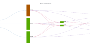
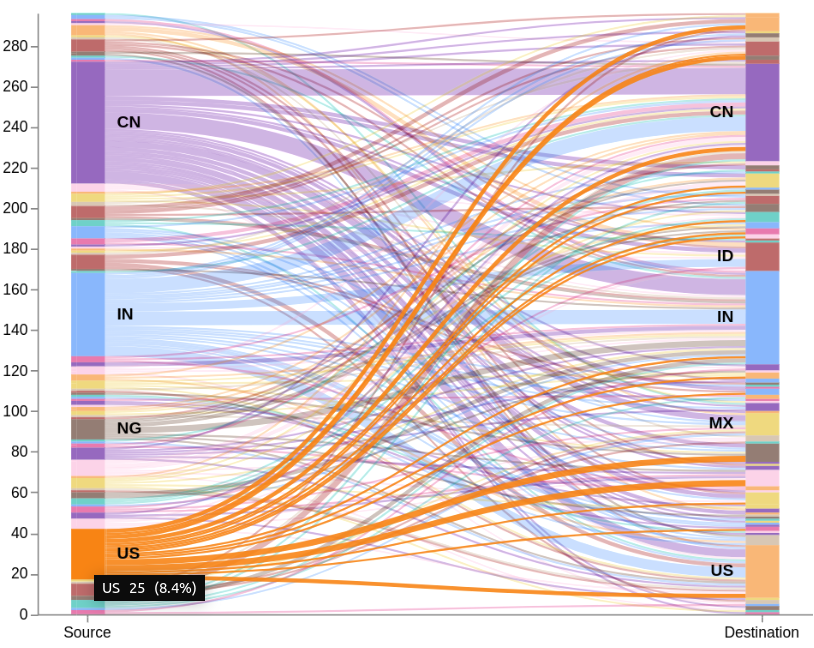
This is an example of how to build an sankey visualization using the vega visualization in Kibana. This vega example has three versions of the sankey visualization. Its an 2 Level, 4 Level and 7 Level example. A Sankey visualization is a great way to show the movement of users through your application. It can also be used for any other kind of data representation that is based on multiple levels and each level has an defined start and ending point.

A Sankey chart is a kind of stream chart with the width of the lines shown relatively to the stream amount. Every passage in the example information has source and objective nation code. The chart will have two modes: all-to-all (default), in addition to it will permit clients to choose either the source or the objective nation, and show just related traffic.

Remarks

This download is not able to run immediately. But its easy to adapt to your needs. You only need to change the index to search in and also the fields that contain the source and the destination information.

Make sure source and destination contain similar values to make it work.

Source

If you wanna learn more about that check this blog which is the source for that example:

https://www.elastic.co/de/blog/sankey-visualization-with-vega-in-kibana

Tested versions
ECS compliant

You must log in to submit a review.

Related downloads

Filebeat Log analysis canvas example

This is a simple canvas dashboard example that analyzes logs created by Filebeat.

Sankey visualization example

This is an example of how to build an sankey visualization using the vega visualization in Kibana.

Sigma AWS Cloudtrail Detection rules

A collection of rules based on the Sigma rules for AWS based on the Filebeat AWS module and Elastic agent integration.

Logstash REST to exec scripts

Make Logstash a REST endpoint that executes scripts or manually adds data in Elasticsearch.

Elastic Stack Monitoring Dashboard

Kibana dashboards that is showing the monitoring data collected by Elastics in built monitoring capabilities.

Watch for changes in IOWaits

A watch which alerts if the time spent by a hosts CPU in IOWait, has increased by more than than N% in the last Y mins.

These downloads could be also interesting for you

APM Services overview canvas

Average rating:

An adaptive turn key canvas example based on Elastic APM data.

Sankey visualization example

This is an example of how to build an sankey visualization using the vega visualization in Kibana.

Vega Compound Gauge

This is a compund gauge visualization made with Vega. Its very helpful for visualization of percentage values.

Timetable canvas

This canvas examples shows timetable data from trains. Its build based on the real world information panel in german trian stations. Its refreshing based on current time.

RUM extension dashboard

This dashboard provide deeper insight into the real user monitoring data collected by Elastic RUM.

Kubernetes architecture overview

Vega visualization to show the dependencies between the different Kubernetes components in a single visualization